Filed under: Illustration | Tags: boston waterfront, Michael LaRiccia, Mike LaRiccia, mylar drawing, t-shirt stand

Image by Michael LaRiccia
My first job. I worked at a Boston T-shirt stand owned by my family for about 10 summers. I always felt this image captured that experience.
Filed under: Illustration | Tags: crowd drawing, drawing on mylar, Michael LaRiccia, Mike LaRiccia

Image by Michael LaRiccia
A crowded men’s room.
Filed under: Illustration | Tags: LaRiccia, mylar drawing, subway drawing
When I was an undergraduate at Umass Amherst I did a series of crowd drawings. The purpose of the series was to communicate the disconnect of society even when we are squished together. At the time I was also dealing with my own anxieties of crowded environments and my place in them. All of these drawings were done on 18″ x 24″ Herculeum mylar. Original I had hoped to shoot these images onto Polymer Gravure plates but it never happened.

pencil drawing on mylar
Here’s the first one of the green line in Boston. I put myself in each drawing.
Filed under: Uncategorized
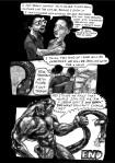
Here is a comic I did year’s ago which opened my eyes to how we look at museums. This is a short story designed to make you think and discuss with others.


Filed under: Uncategorized
For my first book Black Mane, I had a hard time coming up with a cover. When you are the new guy on the block you want to make an impression. Black Mane received the Xeric Award in 2005 which meant I didn’t have to pay for the production. It also meant that I was guaranteed some sort of audience. The cover is a tricky challenge. Commercial comics have really figured out a formula. They just tell you what is basically going to happen in the book or give you a cliff hanger image. At the end of the day that cover needs to sell the product. With indie stuff it’s a little different because we are not catering to the masses. Most indie artists are creating works that satiates the artists goals before the viewers,meaning, I make work that deals with ideas and themes I am interested in, hopefully I can find like-minded viewers. So with Black Mane I initially took a horror type approach. The concept of Black Mane is sort of ambiguous so I wanted to hint at that.The first two attempts were sketches to figure out composition. I didn’t spend time on fonts and type design.
Here is the first try:

I like this image but it was too frightening in the sense that it completely distracts from teh content. This image only indicates horror and doesn’t seem to hint at any underlying mission of purpose. So I scrapped this and tried something totally different. Exhibit B please….

Design-wise this is a terrible cover, but it was closer to what I wanted. This is a photo of my hair when it was at it’s longest. Here I am giving some context to what Black mane could mean, more so then the first image. This has more of a contemplative look but that’s about it. It’s not engaging. I took both ideas and combined them to get the final version. Voila..

The final version is very minimal and modern. Something different from what we usually see in comic book stores. Which is why it stood out at conventions. It’s frightening and unsettling yet there is something pensive about it. You feel a subtle movement in the hair when you see it. The text communicates the uneasiness of the story. I was very pleased with how it turned out. I had it printed on uncoated stock so it has a matte finish.
Filed under: Uncategorized | Tags: banshee, cockrum, covered, LaRiccia, uncanny xmen, wolverine, xmen
The answer is yes…I am still a fanboy. But I challenge you to find an indie comic artist in their thirties who wasn’t at some point a huge fan of commercial comics. I just can’t drop the sentimentality for them. I honestly hope my son grows up enjoying them as much as I did, but who knows. When he’s old enough to read, comics might have regressed so badly to the point where they are all rated R. So for the time being I’ll hold on to my love of yester-year and the classic images and stories that have inspired me. This little number is a piece I did for the Covered Blog which I cannot recommend enough. It’s a perfect forum for artist like myself. A temple to pay homage to artists and images we studied and enjoyed in our youth.

Paying homage to the classics

Filed under: Uncategorized
Joey Weiser is a fantastic cartoonist who is working hard to get his new book Caveman in Space. Thanks to websites like Kickstarter.com, artists can plead to the public to help support their projects, raising thousands of dollars to offset production costs. Joey is hard at work with his new book and is looking for you to help out. Please go to his website and check out his work and consider a donation. If you donate you’ll get all sorts of goodies. Good luck Joey! Here is the link.

Logo for "Cavemen in Space"
-

- Logo for “Cavemen in Space”
-

- From Joey Weiser’s “Cavemen in Space”
Filed under: Comic characters
I am going to try and get back in the blogging swing of things. It’s been a while since I last posted so I’ll try to be good about it. So let’s get back to work. This is a little series I did on Marvel characters.

Sometimes winning isn't all it's cracked up to be.
